When a customer first visits your website or store, the first thing they look at is the overall design. Is it user-friendly, reliable, and meet the demands of current customers? These are some of the few questions you should always ask when creating a Shopify store design.
Many owners when building a Shopify store seem to miss these important checks and therefore the overall user experience and then sales are disrupted.
In this blog, we discuss the nine Shopify store design tips that you can follow to make it user-friendly, catchy, and reliable.
Without anu further ado, let’s get into it.
9 Best Practices to Follow for Enhances Shopify Store Design
Sometimes, missing even the slightest of the tip can lead to bad store design. Therefore, it is better to take the best practices in accpunt and make sure that you follow each of them based on your store demands and needs.
From a clean and responsive team, to optimizing your store’s navigation, and high quality visual, there is a lot you need to do for your account to stand out.
Below are some of the key practices we emphasize on.
1- Choose a Clean and Responsive Theme
Your Shopify store’s theme is the first thing visitors notice, so it needs to be clean, modern, and mobile-friendly. A cluttered design can drive users away, while a well-structured theme enhances user experience. Choose a theme that aligns with your brand and offers built-in Shopify store customization options.
For example, if you sell high-end fashion, a minimalist theme like “Prestige” would highlight your products elegantly. On the other hand, if you run a tech store, a grid-based theme with bold visuals might work better. Ensure the theme is fully responsive, meaning it looks and functions perfectly on both desktops and mobile devices.
| Feature | Importance |
| Mobile-friendliness | Ensures a seamless experience on all devices |
| Customization | Allows branding consistency |
| Fast loading speed | Improves user retention |
2- Optimize Your Store’s Navigation
Customers should be able to find products easily. A well-structured navigation menu improves user experience and boosts conversions. Keep your main menu simple—avoid overcrowding it with too many categories. Instead, use dropdowns to organize subcategories neatly.
For example, an electronics store can have “Laptops,” “Smartphones,” and “Accessories” as primary categories, with subcategories like “Gaming Laptops” or “Wireless Headphones” under them. A search bar in your Shopify store design with predictive text also helps users find products quickly. Shopify’s built-in mega menu feature is a great way to streamline complex navigation structures. It will definitely help in boosting your sales.
Optimize Your Store with our Shopify Store Design Services
3- Improve Site Navigation & User Experience
Beyond menus, other navigation elements play a crucial role. Breadcrumb navigation helps users track their path on your site, making it easy to go back.
A great example is Amazon’s breadcrumb navigation, which displays something like: Home > Electronics > Headphones > Wireless Headphones. This structure reassures users they are in the right place.
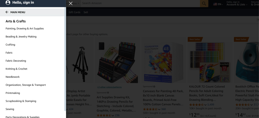
Here we have another example from Amazon. In the screenshot below you can see that the main menu gives the overview of main categories.

Once you click on the main heading, it takes you to the new menu that has other subcategories. This makes the navigation easier for the customers/users.

Additionally, make sure your site loads quickly as the recent studies show that 53% of mobile users abandon a site if it takes longer than three seconds to load. You can also use tools like Google PageSpeed Insights to analyze performance and optimize images to reduce load times.
Best Tools for Shopify Store Design
Let’s take a look at some of the best tools you can use:
- Shopify Theme Editor
- PageFly
- Shogun Page Builder
- Canva
- Hotjar (for UX analysis)
4- Use High-Quality Visuals
Images make or break an online store. Blurry, low-resolution images can diminish credibility, whereas high-quality visuals enhance trust and engagement. Shopify supports high-resolution images, so take advantage of it.
For example, instead of using a plain product image, showcase different angles, zoom-in features, and lifestyle images that demonstrate real-world use. If you sell furniture, displaying an armchair in a cozy living room setup helps customers visualize it in their space. Consider using 360-degree images or videos for an immersive experience.
5- Focus on Branding Consistency
Your store’s design should align with your brand identity. A mix of random fonts, inconsistent color schemes, and mismatched visuals can confuse customers and make your store look unprofessional.
For instance, a skincare brand might stick to pastel colors, minimalistic fonts, and soft imagery to create a sense of calm. In contrast, a fitness brand may use bold typography and energetic colors.
| Branding Element | Why It Matters |
| Color Scheme | Strengthens brand identity |
| Typography | Enhances readability |
| Logo Placement | Increases brand recognition |
6- Streamline the Checkout Process
A complicated checkout process is one of the biggest reasons for cart abandonment. Keep it simple such as you can allow guest checkout, minimize form fields, and offer multiple payment options.
For example, instead of requiring users to create an account, provide an option to check out as a guest. Also, integrating one-click payment solutions like Apple Pay or Google Pay speeds up the process. Display security badges like SSL certificates to reassure customers their payment details are safe.
7- Leverage White Space and Typography
White space isn’t just empty space. It helps improve readability and user focus. A well-spaced layout prevents visual clutter and makes your content more digestible.
For example, Apple’s website uses generous white space and clean typography, making product descriptions easy to read. Stick to two or three font styles and maintain a consistent text hierarchy to ensure readability.
Get custom Shopify website design
8- Add Social Proof and Trust Signals
Another important factor about enhancing your Shopify store design is adding social proof and trust signals. Customers are more likely to buy when they see positive reviews and trust indicators. Showcase product ratings, customer testimonials, and user-generated content to build credibility.
For example, if you sell skincare products, displaying before-and-after photos from real customers can boost confidence in your brand. Trust badges, such as “Money-Back Guarantee” or “Secure Checkout,” also help reassure buyers and you don’t want to miss that.
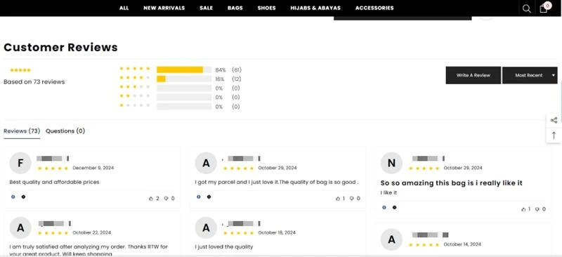
Here is an example below for you to look at – you can see that they have added the customer reviews and rating that builds trust and give insight to the prospects.

9- Test and Iterate Your Design
Your Shopify store isn’t a one-time setup—it needs continuous improvements. Run A/B tests to see what design elements perform best to make your Shopify store design is working properly. In addition to that, don’t forget to use heatmaps to track user behavior and identify areas that need improvement.
For example, if you notice many users drop off at checkout, test different button placements or payment options to see what works best. Shopify’s analytics tools provide valuable insights to help optimize your store over time.
Conclusion
Your Shopify store design is the key to success. It directly impacts conversions and user experience. By following these best practices, you can create a store that looks professional, functions smoothly, and keeps customers engaged. Also, the best suggestion from Shopify experts is to regularly update and test your design to ensure it stays relevant and competitive.
Enhance your Shopify Store Design with Bizmia
If you want your store design to meet current trends and also provide best user experience to the users, look none other than Bizmia.
We provide Shopify experts that take improves your store outlook, make it responsive, and focus on branding so that customers actually know you.
Get in touch with us today and never miss a chance to impress your customers.
Frequently Asked Questions
How to design a Shopify store?
Designing a Shopify store starts with choosing a responsive theme that suits your brand. Customize colors, fonts, and layouts to create a seamless shopping experience. Optimize navigation, use high-quality images, and ensure mobile friendliness. Add trust signals like reviews and security badges. Finally, test and tweak based on customer behavior to improve performance.
How to design your Shopify store?
To design your Shopify store, pick a professional theme and customize it to match your brand’s identity. Focus on clean navigation, engaging visuals, and a smooth checkout process. Use white space strategically and maintain branding consistency. Add social proof, such as customer reviews, to build trust. Regularly analyze performance and make adjustments to improve user experience and conversions.
What is the best Shopify theme for beginners?
For beginners, Shopify themes like “Debut” (simple and clean) or “Dawn” (modern and flexible) are great choices. They’re easy to customize, mobile-friendly, and require no coding.
How do I make my Shopify store look professional?
This is one of the most search questions. A professional Shopify store needs a clean layout, high-quality product images, and consistent branding. Choose a minimalist theme, use a clear font, and maintain a uniform color scheme. Optimize your navigation for easy browsing, add trust signals like customer reviews, and ensure fast loading speeds. A well-structured store boosts credibility and conversions.
How can I improve my Shopify store’s user experience?
To improve user experience, focus on fast loading speeds, easy navigation, and a mobile-friendly design. Use clear CTAs, simplify the checkout process, and provide detailed product descriptions with high-quality images. Add a live chat feature for instant support and use customer feedback to make continuous improvements. A seamless experience keeps visitors engaged and encourages more sales.
How do I choose the right Shopify theme for my store?
Choose a Shopify theme based on your industry, brand style, and functionality needs. Look for a mobile-friendly, fast-loading theme with customization options. If you sell high-end products, a minimalist theme works best. For large inventories, use themes with advanced filtering. Shopify’s theme store offers free and paid options, so test demos before deciding.
How often should I update my store’s design?
Regular updates keep your store fresh and user-friendly. Review your design every 3-6 months based on analytics, customer feedback, and industry trends. If you notice high bounce rates or slow sales, optimize navigation, improve visuals, and update product pages. Small tweaks, like refining the homepage layout or checkout process, can boost conversions.
Can I customize my Shopify store without coding knowledge?
Yes, Shopify offers built-in customization options, and tools like PageFly and Shogun make designing easy with drag-and-drop editors. The Shopify Theme Editor lets you change colors, fonts, and layouts without coding. Apps like Canva help with graphics, and third-party integrations add features without technical skills. For deeper customization, hiring a developer is an option.


