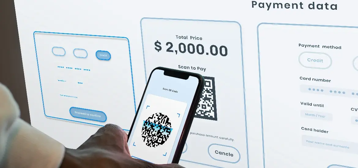
ECommerce checkout UX is the most important part of the customer journey on which the entire customer experience and business sale depends. Having a maize-like checkout is only going to land you in the hot waters. And you don’t want that.
According to the stats, almost 84% of mobile users abandon their cart during online shopping. It is a huge number and being a merchant, you cannot compromise on your sales.
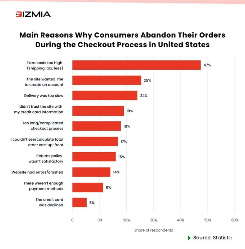
The simple formula is smooth checkout UX = reduced cart abandonment rate
In this blog, we look at the 10 best practices for checkout UX and improving overall sales.
10 Must-DOs for an Effective Checkout UX
For an effective checkout, the best practices include adding guest checkout, minimizing form fields, checking responsiveness, reducing requirement for complex passwords, along with many others. Below is a brief discussion of the effective practices that can increase your sales.
Offer Guest Checkout and Make it Clear
Not every customer wants to create an account on a shopping website. In the eCommerce industry, one must understand the urgency of buying and therefore, guest checkout is extremely important.
Here we have two examples in view: one is GUCCI checkout, and the other one is Etsy checkout. First, take a look at GUCCI checkout.
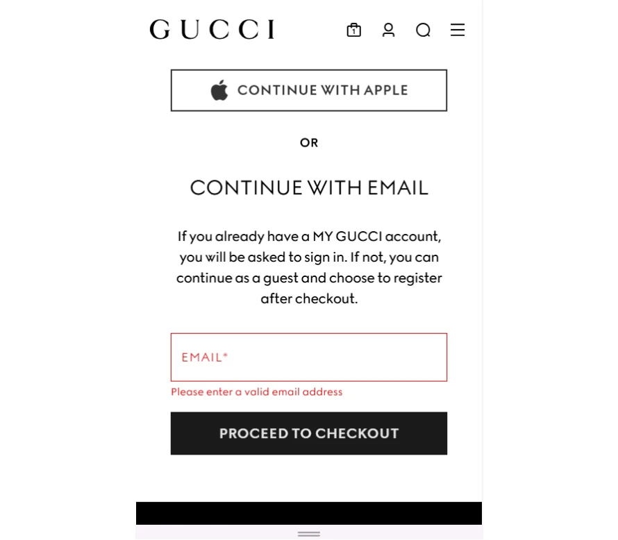
❌ Even though GUCCI has mentioned to ‘continue as a guest’ but it still asks for email address which is vague to the customer. It does not assure the customers that they will continue as guests. 50% of the websites do not offer guest checkout; or if they do, it is not clearly evident on the screen. By not offering guest checkouts, one increases their cart abandonment rate. Discover checkout customizations that drive conversions.
Let’s see another example i.e., Etsy Checkout.
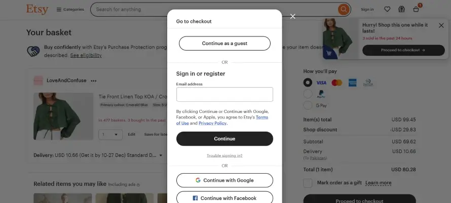
✅ The Etsy checkout offers a smooth and clear guest checkout as there is a button. It assures customers that they will continue as guests without having to fill in any additional details.
For reducing cart abandonment rate, you must add a guest checkout option so that the customer stays on the page and do not exit it. Doing it will drastically improve the results and reduce the friction for first-time buyers, adding to the better health of your eCommerce store.
Minimize Form Fields
No need to add the extra fields that are going to consume users’ time and frustrate them. The best approach is to keep the form fields at a minimum so that users only add the required and necessary information. It will keep the frustration at bay and users will be able to complete their checkout smoothly.
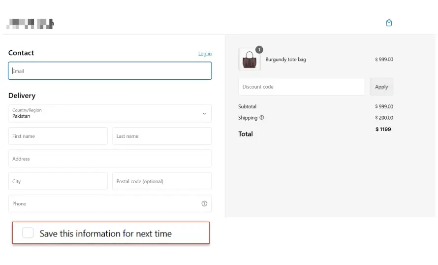
Also, in the form field section, give an option for ‘save this information for next time’. It will save their time and next time they shop from your website, it will be easier to complete the checkout.
✅ Below is an example of keeping the information save for next time along with minimum fields. It allows customers to complete their shopping easily (this time and for future purchases).
Display a Progress Indicator
A progress indicator is critical when you want to keep your customer updated. Many eCommerce websites and stores miss out on this important factor, leaving the customer hanging there.
The main purpose of a progress indicator is to guide users through the process with a clear, visual step-by-step indicator, so they know where they are in the process.
It is a great strategy to let customers place their trust in you. Below is an example from one of the viral marketing brands i.e., TEMU that showcases perfect example of eCommerce checkout optimization.
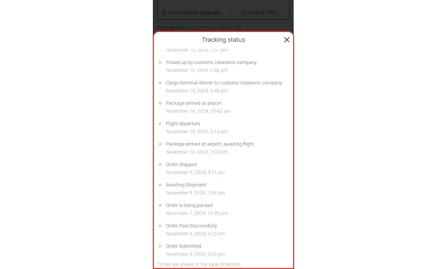
The progress indicator shows updates about the parcel. Whether it is a small move or not, order progress indicators should always be visible to the customer.
Optimize for Mobile Devices
Can you say it’s the most basic practice ever? Like everyone does it, right?!
But the matter of fact is that it still is not done the way it should be.
While designing eCommerce checkout UX, responsiveness on all screen devices is missing. The best practice is to ensure that the checkout page is responsive on all screen devices and the user can easily navigate it as there is an exponential rise in mobile shopping.
Reduce Overly Complex Password Requirements
Many eCommerce websites ask for password requirements when signing up on the website or eCommerce store. They have strict password criteria which have a lot of requirements and that disrupts the customer experience.
There are only a few seconds to retain your customers on the website, that can be lost in the additional unnecessary restrictions.
The best recommendation for merchants and business owners is to keep password restrictions minimum. This will reduce friction and frustration. The optimal length for keeping a password is 6-8 characters and it should remain this unless there is extremely confidential data.
Let’s see an example below.

✅ Constant Contact, an email tool, offers the best example for keeping the password restrictions minimum. It only has one restriction i.e. between 8 and 80 characters. So, the checkout UX for free trial has a smooth flow where user can sign up under two minutes with limited restrictions for password creation.
Offer Multiple Payment Options
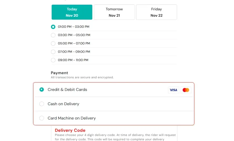
With a wide range of target audience and customer base, it is essential to understand the need for multiple payment options for ease. ECommerce websites with limited payment options can have less conversion rate and high cart abandonment rate as compared to those who offer various payment options such as credit/debit cards, digital wallets, PayPal, etc.
✅ In the example below, the eCommerce store offers three payment methods i.e., Credit & Debit cards, COD, and card machine on delivery. While we were surveying the eCommerce checkout UX, these three methods were proven to be helpful for customers in case they want a same day or different day delivery.
Enable Easy Cart Edits
Imagine deleting an item from cart becomes a task!
No way!
Customers want one-click action when it comes to editing their online shopping carts.
While developing checkout flow, make sure that your customers can easily add or remove items, and update the quantities without having to leave the checkout page.
It will reduce friction, and the user would not have to move back and forth for deleting, updating, or adding the items.
Let’s take an example.
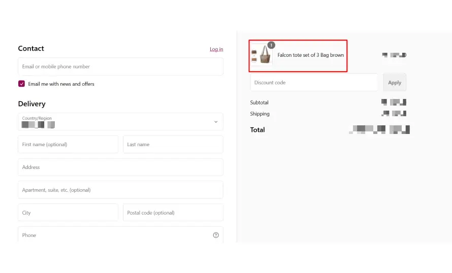
❌ As shown in the screenshot, there is no option for adding, deleting, or updating the items. The user would have to go back to the products page and do the rest. The better approach would be that the user can add, delete, or update quantities directly from the ‘checkout’ page.
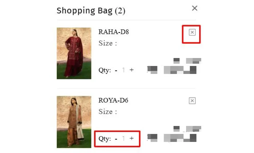
✅ In this example, you can clearly see that from the checkout page, user can add and reduce the number of items and even delete it from the checkout directly.
Show Trust Signals
Trust signals on the checkout UX are a critical part of reducing churn and cart abandonment rate. They build trust and assure the customer that they are buying from authentic and trusted sellers.
While designing the checkout UI, make sure you display security badges, customer reviews, and money-back guarantees to build trust and reduce purchase hesitation.
Being on the list of ecommerce checkout best practices, this is necessary and should not be ignored.
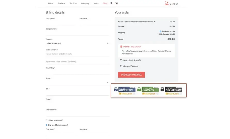
✅ We have an example of FlexSCADA, in which you can see there are trust badges. This is to assure customers that their information is safe, and they can easily complete the checkout process.
Streamline the Confirmation Page
A confirmation page is an absolute necessity for eCommerce checkout UX. Many eCommerce businesses show a simple confirmation page with minimal details which is not a good practice to follow.
A good approach for an order confirmation page is to provide a concise, clear confirmation page with an order summary, estimated delivery date, and customer service contact info after the order has been placed.
Let’s take an example of a good and bad order confirmation page.
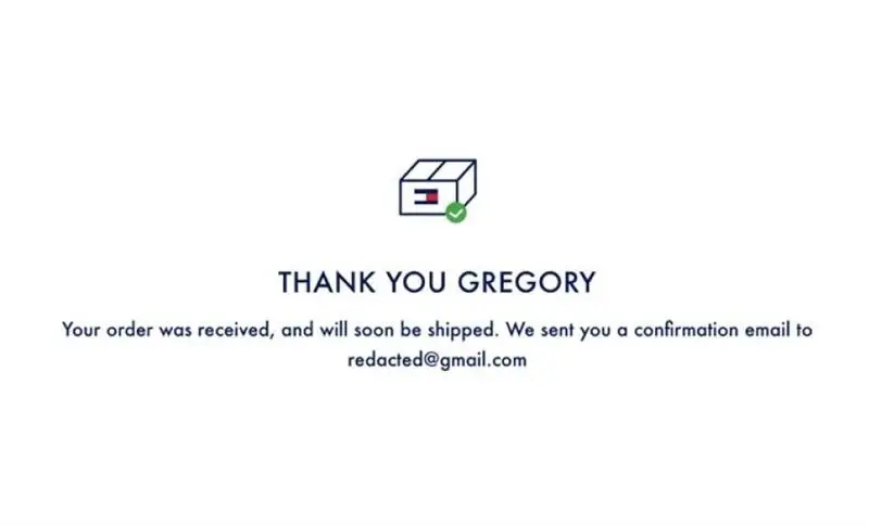
❌ In this order confirmation page, a two-liner text is given. It lacks order details, product details, selected payment methods, and shipping information.
Let’s take a look at an example from Walmart order confirmation page which has complete details.
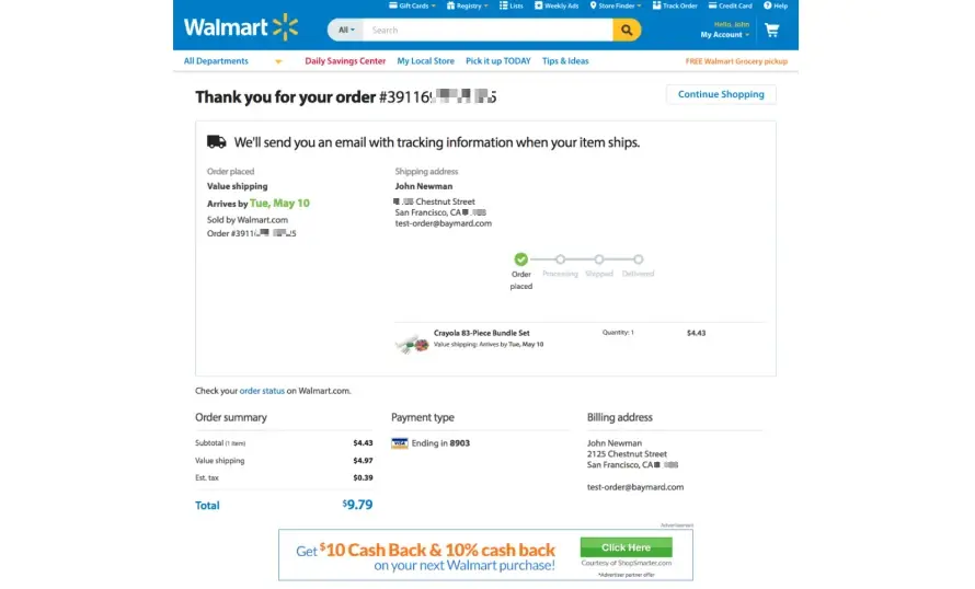
It has the following points which should be in an order confirmation page:
- Confirmation with an order number
- Notification about shipping updates
- Estimate arrival date
- Order Summary
- Shipping Address
- Order processing bar
- Payment details
- Billing Address
Use Data for Further Improvement
Studying customer behavior is important for optimizing your website. For eCommerce checkout optimization, you must track and analyze customer behavior, do A/B testing, and see how users navigate or face an issue.
It will help you in understanding customer behavior while also enabling to make improvements to your store.
What Tools Are Best to Study Customer Behavior?
There are a number of tools out there that can help you for customer behavior analysis. The top names include Hotjar, Google Analytics, CrazyEgg, and Mixpanel.
Conclusion
By following the above-mentioned eCommerce checkout practices, you can create an optimal flow for the users and drive more revenue for your business. Ranging from guest checkout, minimum form fields, to easy cart edits, and payment options, each factor plays a great role in reducing friction, improving conversion rates, and enhancing customer satisfaction.
ECommerce Checkout Optimization
Increase your ROI and optimize eCommerce checkout UX with our expert developers who create a user-friendly checkout page leading to seamless customer experience.
Don’t let another day pass with high cart abandonment rate. Hire eCommerce developers today and achieve your goals.
Frequently Asked Questions
Why is checkout experience important?
Creating a good checkout experience is essential to reduce th metrics like churn rate, cart abandonment rate, and bounce rate of your website. If you deliver a smooth checkout experience to your customers, they will complete the checkout quickly and you will get sales.
How can I prevent cart abandonment during checkout?
The first step to prevent cart abandonment is making a smooth UX. Ask yourself if all of the above-mentioned points are present on your checkout page?
In addition to that, you can also send emails to remind users about cart abandonment, offer discounts, and promo codes. But most importantly, offer a guest and smooth checkout experience.
Should I offer multiple payment options?
Yes! Offering multiple payment options will give a multitude of options to choose from and they are likely to purchase from your website or store. If there are limited payment options, the potential customer might hop to another website with more options.
Can Bizmia help me with eCommerce checkout optimization?
For eCommerce checkout optimization, we ensure that it is targeted at your customers and enable them to quickly complete it. Our eCommerce developers for hire provide robust services that help you get more sales as cart abandonment rate reduces.
